8mm Forum


my profile | my password | search | faq | register | forum home
  next oldest topic   next newest topic
» 8mm Forum   » 8mm Print Reviews   » Fantasia 2000 (Page 2)

 - UBBFriend: Email this page to someone!  
This topic comprises 2 pages: 1  2 
 
Author Topic: Fantasia 2000
Bill Brandenstein
Phenomenal Film Handler

Posts: 1632
From: California
Registered: Aug 2007


 - posted August 22, 2012 12:34 PM      Profile for Bill Brandenstein   Email Bill Brandenstein   Send New Private Message       Edit/Delete Post 
...but not a single one of my 16 viewers seemed to notice it. Certainly no comments were made concering the Blue Hue, boo hoo.

 |  IP: Logged

Akshay Nanjangud
Jedi Master Film Handler

Posts: 637
From: Dallas, TX
Registered: Nov 2011


 - posted August 22, 2012 01:03 PM      Profile for Akshay Nanjangud   Email Akshay Nanjangud   Send New Private Message       Edit/Delete Post 
Bill, you are right about the viewers. No one I watched it with complained. Having said that, the skin tones during the introductions are quite bad though. Like I said, it doesn't hurt much during the cartoon sequences.

 -

[ August 27, 2012, 09:41 PM: Message edited by: Akshay Nanjangud ]

 |  IP: Logged

Osi Osgood
Film God

Posts: 10204
From: Mountian Home, ID.
Registered: Jul 2005


 - posted August 22, 2012 01:05 PM      Profile for Osi Osgood   Author's Homepage     Send New Private Message       Edit/Delete Post 
Glad to see that your enjoying your print of Fantasia 2000 Akshay, and very nice screenshots! I wish I was capable of that. The "Rhapsody in Blue" sequence is supposed to be various shades of blue i.e. "Rhapsody in Blue".

By the way, I do agree, the parts that are the most affected by the bluish tint are the live action sequences.

By the way, I would personally suggest, for those who do not have the "Sorcerers Apprentice" number in thier print (The one I traded to Akshay doesn't have it), go ahead and get a good color copy off of ebay of the super 8 release that Disney did back in the day.

This is because the prints made especially for the "Fantasia 2000" are letterboxed, which is cutting off a good deal of the image from top to bottom, where the original super 8 release from the early 80's is the near correct apsect ratio. That's just a pet peeve O mine.

--------------------
"All these moments will be lost in time, just like ... tears, in the rain. "

 |  IP: Logged

Steve Klare
Film Guy

Posts: 7016
From: Long Island, NY, USA
Registered: Jun 2003


 - posted August 22, 2012 01:31 PM      Profile for Steve Klare   Email Steve Klare   Send New Private Message       Edit/Delete Post 
Is the Blue Hue a Boo Boo?

It sounds like a fantastic movie. I love the original Fantasia and would love to have a print of this. Back a few years ago Derann specifically offered this on the reel at a time installment plan (with six months no interest financing!) and I was willing, but time ran out.

Walt Disney originally expected to subsititute new sections into the original every couple of years and re-release the film. Unfortunately this is the one time it ever really happened.

--------------------
All I ask is a wide screen and a projector to light her by...

 |  IP: Logged

Bill Brandenstein
Phenomenal Film Handler

Posts: 1632
From: California
Registered: Aug 2007


 - posted August 22, 2012 03:07 PM      Profile for Bill Brandenstein   Email Bill Brandenstein   Send New Private Message       Edit/Delete Post 
Osi, you're incorrect about the letterboxing cutting off anything. Buried in my lengthy post above is mention that "Apprectice" is both letterboxed AND pillarboxed in these Fantasia 2000 prints, in other words zoomed out so there is black on all sides. That alone is reason to pursue a different print for standalone use, but at least Disney didn't alter the image composition for the feature, for which this approach is appropriate.

 |  IP: Logged

Osi Osgood
Film God

Posts: 10204
From: Mountian Home, ID.
Registered: Jul 2005


 - posted August 24, 2012 01:26 PM      Profile for Osi Osgood   Author's Homepage     Send New Private Message       Edit/Delete Post 
That's interesting because the only "Fantasia 2000" segment of "Sorcerer's Apprentice" that's a part of this "2000" print is letterboxed on the top and bottom, but not on the left and right sides, (as we actually see on the screenshots on this very post), but it would be interesting to see some screenshots of this super 8 print with black bars on the left and right, as well as the top and bottom.

--------------------
"All these moments will be lost in time, just like ... tears, in the rain. "

 |  IP: Logged

Bill Brandenstein
Phenomenal Film Handler

Posts: 1632
From: California
Registered: Aug 2007


 - posted October 18, 2012 01:20 AM      Profile for Bill Brandenstein   Email Bill Brandenstein   Send New Private Message       Edit/Delete Post 
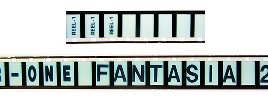
Here finally are some photos. So this print is 'masked' from the original 35mm source such that even the leaders have frame masking where otherwise the film would be clear, and that masking area is thus always black. Here's what that looks like on the head of Reel 1:
 -

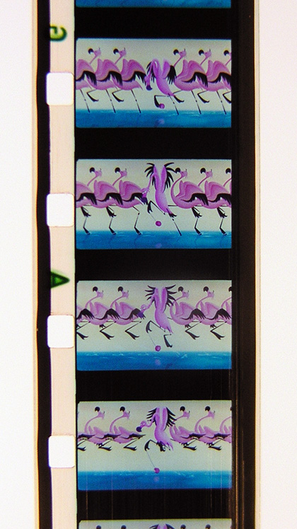
So in the movie, where the 1.85:1 ratio actually matters, the film looks like this (Carnival of the Animals sequence):
 -

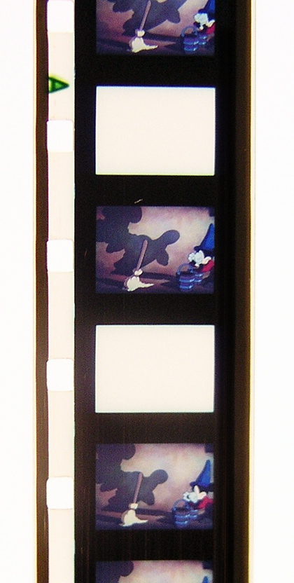
Finally, in the Sorcerer's Apprentice you get this when the print mask (the same as letterboxing in video) is combined with side masking (pillarboxing) making a boxing match!:
 -

 |  IP: Logged

Tom Photiou
Film God

Posts: 4837
From: Plymouth U.K
Registered: Dec 2003


 - posted October 18, 2012 06:42 AM      Profile for Tom Photiou     Send New Private Message       Edit/Delete Post 
It'll be a while before these turn red [Big Grin] [Wink]

 |  IP: Logged

Osi Osgood
Film God

Posts: 10204
From: Mountian Home, ID.
Registered: Jul 2005


 - posted October 19, 2012 12:39 PM      Profile for Osi Osgood   Author's Homepage     Send New Private Message       Edit/Delete Post 
Bill, I stand corrected, and wonderful screenshots showing the whole frame and sprockets.

You know, the funny thing is, once it starts to fade someday, perhaps the reddening (?) will start to balance out the bluish-ness?

--------------------
"All these moments will be lost in time, just like ... tears, in the rain. "

 |  IP: Logged

Bill Brandenstein
Phenomenal Film Handler

Posts: 1632
From: California
Registered: Aug 2007


 - posted October 19, 2012 01:57 PM      Profile for Bill Brandenstein   Email Bill Brandenstein   Send New Private Message       Edit/Delete Post 
Just think of all the fun our grandkids will have still trying to make those projectors run!!!

 |  IP: Logged

Bill Brandenstein
Phenomenal Film Handler

Posts: 1632
From: California
Registered: Aug 2007


 - posted January 03, 2018 02:25 PM      Profile for Bill Brandenstein   Email Bill Brandenstein   Send New Private Message       Edit/Delete Post 
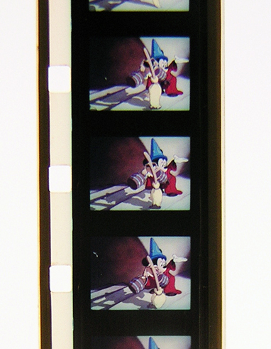
Just an update here with another photo (and please don't miss the ones above as well) to make the aspect ratio of this presentation clear.

Derann's Super 8mm print was sourced from a 35mm copy or negative, so as mentioned above, these prints conform to the theatrical release. Thus, the print is hard matted to 1.85:1.

To conform to a "common height" principle of theatrical exhibition, the "Sorceror's Apprentice" segment is "window-boxed" to create 1.37:1 within the 1.85:1 space:
 -

Thus, if you size your screen precisely to the area used, "Apprentice" will look great, "pillarboxed" on the screen as intended. However, you wouldn't want to use this as a standalone segment on a normal 4:3 screen without specific zoom compensation.

By the way, I have 5.1 SPDIF wave and stereo wave files available for this feature if anyone is interested. However, I have all 4 reels together on a very full "superspool" and it would take some work to pull the audio for the reels apart, although given some time, I could do that. How the reels are joined together is important as sync conforms precisely to the DVD release, frame accurate.

[ January 09, 2018, 04:31 PM: Message edited by: Bill Brandenstein ]

 |  IP: Logged

Osi Osgood
Film God

Posts: 10204
From: Mountian Home, ID.
Registered: Jul 2005


 - posted January 05, 2018 10:49 AM      Profile for Osi Osgood   Author's Homepage     Send New Private Message       Edit/Delete Post 
I had sold my print of Fantasia to Ackshay and even when I had it, i didn't have as part of the feature when i got it, the Sorceror's Apprentice. I was always miffed by that.

It didn't help much that this film had an overall bluish caste to the color, but it didn't hurt the "Rhapsody" portion, as that was largely different shades of blue, period.

Does anybody know as to why the prints of the feature were so blue to begin with? Derann didn't have this problem years before with thier prints. I've seen very bluish prints Bambi as well as Mary Popppins as well and I've always kind of assumed that they were late prints from that last film lab that they used.

--------------------
"All these moments will be lost in time, just like ... tears, in the rain. "

 |  IP: Logged

Tom Photiou
Film God

Posts: 4837
From: Plymouth U.K
Registered: Dec 2003


 - posted January 05, 2018 04:27 PM      Profile for Tom Photiou     Send New Private Message       Edit/Delete Post 
unfortunately we only have one part of this feature which is firstly introduced by Steve |Martin followed by,
Ludwig van Beethoven's 'Symphony No. 5 in C minor
Ottorino Respighi's 'Pines of Rome',
I do love the image, i often read about the blue tint but i do like it, we also have the trailer which is also excellent. i saw this on TV once and personally thought this whole blue thing is actually how the film looks. My only problem is finding more parts. [Wink]

 |  IP: Logged

Adrian Winchester
Film God

Posts: 2941
From: Croydon, London, UK
Registered: Aug 2004


 - posted January 05, 2018 10:24 PM      Profile for Adrian Winchester     Send New Private Message       Edit/Delete Post 
I've never heard an explanation for the bluish cast but I recall hearing soon after the release that every effort was made to minimise this, but it was impossible for the lab to fully eradicate it. It's definitely not the 'usual' Derann bluish prints issue; if anyone was unfortunate enough to buy a print that ALSO had the 'other' bluish tint problem, it would probably look about 99% blue! If Disney still needed to approve a Super 8 print at this stage, them doing so may have implied that they knew that there was an issue with the negative supplied. It would be interesting to know if the US 16mm rental prints had perfect colour.

--------------------
Adrian Winchester

 |  IP: Logged

Brian Fretwell
Phenomenal Film Handler

Posts: 1785
From: London, UK
Registered: Jun 2014


 - posted January 06, 2018 08:28 AM      Profile for Brian Fretwell   Email Brian Fretwell   Send New Private Message       Edit/Delete Post 
The only reason I can think of for this not being corrected is that the print stock may have been balanced more to blue that the printing machines inbuilt correction could cope with.

I remember the old Ferrania colour reversal stock could have its colour balance changed with different colour developer times, but suspect new stock would be more stable and that trick couldn't be used.

 |  IP: Logged

Tom Photiou
Film God

Posts: 4837
From: Plymouth U.K
Registered: Dec 2003


 - posted January 06, 2018 09:05 AM      Profile for Tom Photiou     Send New Private Message       Edit/Delete Post 
during next week i will put up a couple of screenshots, although mine, as everyone's, does have the blue tint to it the skin colours at the start all appear to be ok to me. It's certainly nothing like as blue as one of the previous images where the whole thing is blue. Where there seriously many like that? i dont think i would have accepted it like that unless it was a white box special [Wink]

 |  IP: Logged

Larry Arpin
Jedi Master Film Handler

Posts: 953
From: Sunland, CA, USA
Registered: Dec 2006


 - posted January 07, 2018 01:52 PM      Profile for Larry Arpin   Author's Homepage   Email Larry Arpin   Send New Private Message       Edit/Delete Post 
Bluish tint=poor lab work. It is also possible that thay made the negative from a print using intermediate stock meant to copy interpositives without an orange base. This would cause the negative to produce bluish images automatically. I had a Tom and Jerry cartoon that was originally a Walton negative but the print was very pinkish. I later picked up an older print with perfect color. Simply poor lab work.

 |  IP: Logged

Adrian Winchester
Film God

Posts: 2941
From: Croydon, London, UK
Registered: Aug 2004


 - posted January 08, 2018 03:29 AM      Profile for Adrian Winchester     Send New Private Message       Edit/Delete Post 
But a factor that makes it seem not entirely down to the lab is that the trailer, released at around the same time, has excellent colour, while EVERY print of the feature is bluish to some degree. Considering the extra scrutiny upon Disney releases, it would seem extraordinary if they couldn't get any of them about right. I'm sure I recall hearing that Derek had said around the time that lab "correction" attempts had minimised the tint as much as possible.

--------------------
Adrian Winchester

 |  IP: Logged

Osi Osgood
Film God

Posts: 10204
From: Mountian Home, ID.
Registered: Jul 2005


 - posted January 08, 2018 12:35 PM      Profile for Osi Osgood   Author's Homepage     Send New Private Message       Edit/Delete Post 
Quite interesting that the trailer was great color.

--------------------
"All these moments will be lost in time, just like ... tears, in the rain. "

 |  IP: Logged

Bill Brandenstein
Phenomenal Film Handler

Posts: 1632
From: California
Registered: Aug 2007


 - posted January 09, 2018 11:22 AM      Profile for Bill Brandenstein   Email Bill Brandenstein   Send New Private Message       Edit/Delete Post 
Agreed.

Larry may be on to something here if the negative was made on the wrong (not orange) stock.

[ January 09, 2018, 04:29 PM: Message edited by: Bill Brandenstein ]

 |  IP: Logged

Osi Osgood
Film God

Posts: 10204
From: Mountian Home, ID.
Registered: Jul 2005


 - posted January 09, 2018 11:48 AM      Profile for Osi Osgood   Author's Homepage     Send New Private Message       Edit/Delete Post 
It was also interesting to see that Bill's print is on Agfa film stock, as the print I once had was on L.P.P. Bill's print most certainly doesn't look as bluish as mine did.

--------------------
"All these moments will be lost in time, just like ... tears, in the rain. "

 |  IP: Logged

Bill Brandenstein
Phenomenal Film Handler

Posts: 1632
From: California
Registered: Aug 2007


 - posted January 09, 2018 04:33 PM      Profile for Bill Brandenstein   Email Bill Brandenstein   Send New Private Message       Edit/Delete Post 
Oh, that is NOT good. Interesting that the differing print runs don't match. Good to know.

 |  IP: Logged

Adrian Winchester
Film God

Posts: 2941
From: Croydon, London, UK
Registered: Aug 2004


 - posted January 10, 2018 12:07 AM      Profile for Adrian Winchester     Send New Private Message       Edit/Delete Post 
Around 2003, AGFA stock ceased to be available, but fortunately LPP Super 8 stock returned, so the earlier prints - and probably the majority - would be AGFA. I don't think LPP was more prone to being bluish, but the lab's quality control towards the end seems to have been worse than ever!

--------------------
Adrian Winchester

 |  IP: Logged


All times are Central
This topic comprises 2 pages: 1  2 
 
   Close Topic    Move Topic    Delete Topic    next oldest topic   next newest topic
 - Printer-friendly view of this topic
Hop To:

Visit www.film-tech.com for free equipment manual downloads. Copyright 2003-2019 Film-Tech Cinema Systems LLC

Powered by Infopop Corporation
UBB.classicTM 6.3.1.2