|
Author
|
Topic: How so obsessed I am with MGM cover!
|
Winbert Hutahaean
Film God
Posts: 5468
From: Nouméa, New Caledonia
Registered: Jun 2003
|
 posted November 18, 2005 05:39 AM


Hello all...
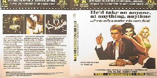
After Douglas confirmed me here that The Cincinnati Kid (released by MGM) did come originally with poor artworks cover, i.e plain paper and handwritting!!, I finally managed to make my own cover. But I was so obsessed with the MGM cover style and perhaps I was so influenced by Mike Peckham to put those MGM titles on one shelf!
It is indeed nice to see those MGM in the right order and in one type clamshell case.

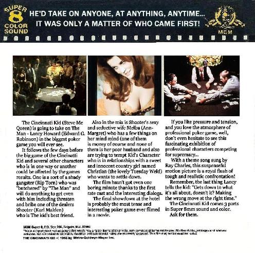
It looks like other MGM cover, doesn't it? Unfortunatelly, I cannot upload bigger files in this forum. Otherwise you can also read the resume on the backpage cover, which I deliberately made with the MGM language's style too. (e.g. "...the Cincinnati Kids comes 3 parts in Super 8mm sound and color. Ask for them!" ![[Wink]](wink.gif) ![[Big Grin]](biggrin.gif) ) )
But probably this would help.

Anybody wants to get the bigger files can contact me, I can email that to you
Cheers,
[ November 28, 2005, 10:34 PM: Message edited by: Winbert Hutahaean ]
--------------------
Winbert
| IP: Logged
|
|
|
|
|
|
|
|
|
|
|
|
Winbert Hutahaean
Film God
Posts: 5468
From: Nouméa, New Caledonia
Registered: Jun 2003
|
 posted November 28, 2005 10:22 PM


Mike,
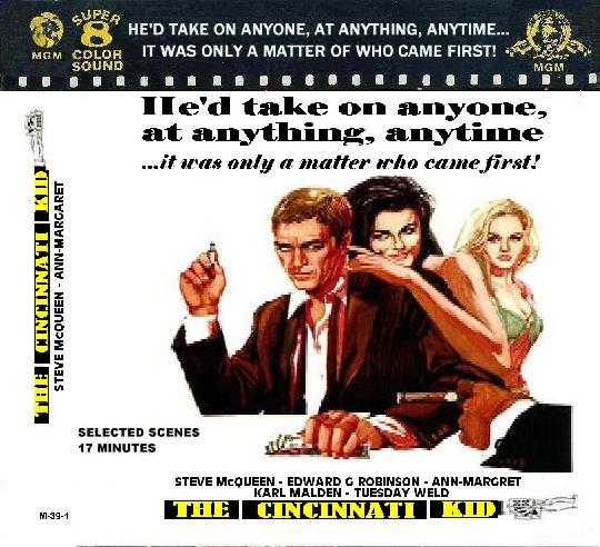
The Cincinnati Kid is M391, but believe me in the original cover, that number was handwritten!!
It took hours of work to finalise this cover. I first visited websites that have resume of this title. I tried to find the much 1970s resume style, i.e. convincing and repeating words ![[Big Grin]](biggrin.gif) . From there, I had to find the front picture which was not photo shot, since almost all MGM covers were artpicture (Different with Germany titles which used a lot of photo stocks). The most painful one was to find the closest fonts available in my computer to the MGM's. Sometime if my computer did not have those MGM fonts, I had to "borrow" some fonts (meaning scan, cut and paste) from other MGM cover to create new sentences. From there then I re-arranged those resume to be fit to the space on those three columns on the back page. . From there, I had to find the front picture which was not photo shot, since almost all MGM covers were artpicture (Different with Germany titles which used a lot of photo stocks). The most painful one was to find the closest fonts available in my computer to the MGM's. Sometime if my computer did not have those MGM fonts, I had to "borrow" some fonts (meaning scan, cut and paste) from other MGM cover to create new sentences. From there then I re-arranged those resume to be fit to the space on those three columns on the back page.
Below is my front cover, but I don't know how to reduce the pixel. I used MS Paint and when I assigned to reduce the pixels, it cut the picture. So, I just streched the picture to below 50% and it came with this smudge quality.

(I saw some of you could post bigger/better picture, how did you that?)
cheers,
--------------------
Winbert
| IP: Logged
|
|
|


 UBBFriend: Email this page to someone!
 Printer-friendly view of this topic


 UBBFriend: Email this page to someone!
 Printer-friendly view of this topic