This is topic Atilla The Hun. Early Derann Release on 2 x 800ft spools in forum 8mm Print Reviews at 8mm Forum.
To visit this topic, use this URL:
https://8mmforum.film-tech.com/cgi-bin/ubb/ultimatebb.cgi?ubb=get_topic;f=4;t=000746
Posted by Tom Photiou (Member # 130) on November 15, 2018, 03:16 PM:
First of all, for me, this wasn't so much of a viewing, more of an endurance. This is my Brothers film and not one i particularly enjoy as i prefer something a little more modern, however, we both watch all of each others films no matter. While he has viewed it many times himself, on my list i noted that it was 1998 when i last viewed it, being an early Derann release from the early to mid 70s i was almost certain that this print was going to be red as most of the films from Derann from that particular era are these days.
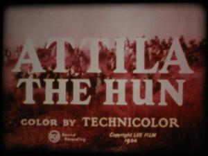
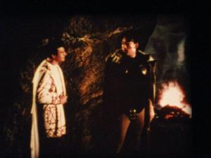
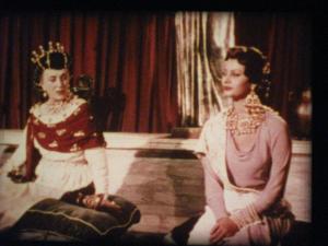
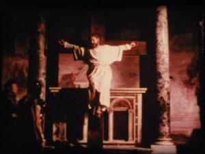
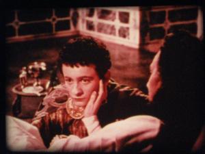
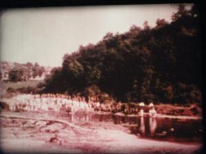
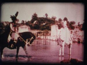
I gave it a quick clean before viewing and was actually very surprised at how good this print still is. Yes it has some fade but it was never particularly colourful when we bought it God knows how many years ago, This is one of our early prints, so probably around 40 years ago. The odd thing about this one is that the colours on the darker scenes are actually a hell of a lot better than those bright outdoor scenes which are very muted and, in some places, single coloured. Overall, this is a pretty good print, being an Italian / French production the sound is dubbed into English, the sound is very good and very clear and the sharpness of the image is also very good.
This one is to be listed on ebay now as he has promised himself that once they start to go they lose there appeal to him, we had a chat and do agree that this film always had a muted colour look to it. At the end of the day, if it was faded all those dark scenes would be red, in actual fact, they are all quite good, much of the red you see is due to the fact that many of the indoor cave sequences are lit by fire giving the whole thing that reddish look, you will note from other scenes that the colours are indeed fair to good. The condition of the print itself is pretty good with only some light black lines to the right, although parts 3 and 4 do have a few more, but again, overall, pretty good given the age of this print.
[ May 02, 2019, 03:53 PM: Message edited by: Tom Photiou ]
Posted by Osi Osgood (Member # 424) on November 16, 2018, 11:51 AM:
Boy, you're right about those cave sequences. very nice color on them! On my "Adventures of Tom Sawyer", i have a similar situation where there are some reels of it that almost have "passable" olor, and other where the blacks are just brown.
But i have noticed as well, that, for instance, in the classroom sequence, there are shots where it looks faded, and when it shows that same shot (or angle) later in the sequence, the color is much better, yet on the same reel of film without any splices, so, i said all of that to say this, that much of the problems to some releases of the past is more down to original negative and the variance in color, than to film fade ...
... and I'm betting that this film had "marginal" color to begin with as, with such nice blacks in the cave sequences, well, as you said, if there was a lot of fade, it woul show up the most in the black cave sequences.
Tom, I don't know if you would be willing to try, but could you compare the film stock on the cave sequence reels to the later reels and see if there was a different film stock on various reels of the film? It's just a curiosity of mine. ![[Smile]](smile.gif)
Posted by Tom Photiou (Member # 130) on November 16, 2018, 04:19 PM:
Osi, i took a quick look tonight and as far as i can see they are all the same. In fact, with exception to a few of the broad daylight scenes, the colour isn't too bad throughout. As you said, this movie never had a "technicolour" look to it, it was always quite muted. These images are not that good, if you look at the second to last image, when viewed, that big bank of trees in the background is immensely green and during the viewing we both said"wow thats good". many of the inside sequences really took us by surprise. The outdoor scenes in the forest are muted but it is set in winter, there are no leaves on the trees so you immediately think the colours vanished.
On the other channel, Barry of Indi 8 informed us that,
quote "You've got to remember, this was an early Derann release, long before the Rank upgrade on its printer, and well before LPP was the norm, so Tom's print is remarkable that it has as much colour as it still has, most prints I've seen of this title are just as bad as Vidar's, so it's the luck of the draw, perhaps Tom's was a slightly later re-print. who knows!"
Vidars images are red which was how our Lasr command went.
[ November 17, 2018, 12:38 PM: Message edited by: Tom Photiou ]
Posted by Osi Osgood (Member # 424) on November 17, 2018, 11:58 AM:
... and then, of course, there is the horror of just bad screenshot taking (especially on my part) where every screenshot, whether an L.P.P. print or not, appear to be red!
(grrrr!)
Posted by Tom Photiou (Member # 130) on November 17, 2018, 12:42 PM:
Osi, your not alone, although i take reasonable screenshots i can never show the colours as they are, they always appear to be more faded than they are on screen. The problem is i am more interested in viewing the film ,i simply use an old digital canon snapshot camera set on auto with the flash off and the ISO set on high. This seems to work ok, in order to get them reasonably clear i only take a shot where the on screen image is still, i.e, no action shots otherwise they will all be blurry.
I do have a very decent camera, a Nikon D5100 but thats overkill as far as im concerned and then your not watching the film, your attention is on taking pics ![[Wink]](wink.gif)
Posted by Brian Fretwell (Member # 4302) on November 20, 2018, 09:43 AM:
I think I have the trailer to this, probably easier to watch and more entertaining for its brevity.
Visit www.film-tech.com for free equipment manual downloads. Copyright 2003-2019 Film-Tech Cinema Systems LLC

UBB.classicTM
6.3.1.2


![[Smile]](smile.gif)
![[Wink]](wink.gif)