This is topic Blueis print vs good print (Aliens, Super 8mm Derann) in forum 8mm Forum at 8mm Forum.
To visit this topic, use this URL:
https://8mmforum.film-tech.com/cgi-bin/ubb/ultimatebb.cgi?ubb=get_topic;f=1;t=006640
Posted by Winbert Hutahaean (Member # 58) on November 18, 2011, 12:09 PM:
Just not too long gap there were 2 auction for the same print, Aliens (Full Feature, Derann).
First auction:
http://www.ebay.com/itm/ws/eBayISAPI.dll?ViewItem&item=2 00666973126&fromMakeTrack=true&ssPageName=VIP:watchlink:top:en
It went for $355
Second auction:
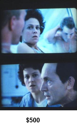
http://www.ebay.com/itm/SUPER-8MM-FULL-FEATURE-ALIENS-STEREO-SOUND-/250929510170
It went $500 !!
Now look at the comparison between the $355 vs $500.
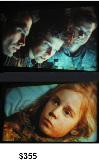
The first one has natural color (eg color skin), good saturation, and sharp.
While the second print is so much blueish (human skin is pale), and soft focus...yet it was sold for 40% higher!!.
If the winner of the second print knew about the first print, he would be really disappointed. To be honest, i can't myself sitting 2 hours to watch that sort of blueish quality. What about you?
BTW, How many Derann titles you know that have so many obvious diversity on print quality?
Posted by Gerald Santana (Member # 2362) on November 18, 2011, 12:33 PM:
Hey Winbert,
The price is significant however, have you considered white balancing on the cameras before the picture is taken? The setting on digital camera's may need adjustment if using a halogen lamp. It could make a big difference to set the camera just right, however you need to play around with the settings.
Another thought that came to mind was the final bid on the first print was after 16 bids, obviously very sought after, while the $500 print only got one bid. This tells me that one of the bidders from the first auction did not want to let this one go by. If it were priced to high, and people did not bid, perhaps the seller will lower the starting bid thus, more people will jump at the chance to get it. But I've seen an item re-listed this way, only to go for more than the original starting price!
Posted by Osi Osgood (Member # 424) on November 18, 2011, 12:45 PM:
That could be the state of that second print. Some of those later Derann releases id have a distinctive bluish cast to them. Remember "Fantasia 2000"? (Deplorable), as well as a print or two of "bambi" that went far wrong?
Posted by Adrian Winchester (Member # 248) on November 18, 2011, 05:54 PM:
Irrespective of whether the pics of the $500 print are fully representative of the look of the actual copy, they look so offputting that the seller is extremely lucky to get the amount he wanted. I think that prints with that excessively bluish look are probably more common from around the late 1990s onwards, as the lab seemed to become more inconsistent. I got my 'Aliens' within about a year of it being released and I'd say the colour is a bit 'cool' but it's a great print. However, I recall seeing another one soon afterwards that was too 'warm' for my liking, so even around 1988 there could be big variations between batches.
With regard to Winbert's question: "How many Derann titles you know that have so many obvious diversity on print quality?", I think the question should be: "Do you know of Derann titles where there's evidence that there's very little diversity in quality?" I suspect that diversity tends to be the norm, apart from perhaps cases where the negative quickly become damaged and there were only one or two batches of prints. I know that Disney placed great emphasis on quality control, so it could be that the lab was leaned upon to achieve greater consistencey with these.
Posted by Mark Todd (Member # 96) on November 18, 2011, 06:12 PM:
There was a point when the labs for Deranns prints finished the specifically super 8 chap.
So after that things generally got bluer, though there was the odd better batch. I suppose it depended who was put on super 8 that day prints were run, but no-one specialised then.
The later Kodak stock was nice but seemed more prone to suffering that way.
There was a period in the early/mid 90`s the prints were superb even though on agfa not lpp.
Best Mark.
Posted by Brad Kimball (Member # 5) on November 18, 2011, 07:21 PM:
I own 3 Derann titles. My copy of "Dracula Prince Of Darkness" digest is an earlier print and looks perfectly normal. My digest of "Taste The Blood Of Dracula" and the cartoon "Lonesome Ghosts" both have the bluish hue you're speaking of which truly doesn't detract from my enjoying them one bit. The quality on all 3 is still terrific.
Posted by Osi Osgood (Member # 424) on November 19, 2011, 12:35 PM:
Yes, the quality was always really good, concerning sharpness, grain ect. It was just that bluish cast that I hated. Fortunately, I didn't run into too many of those defective prints. Desapite my discouraging post earlier in this series, Derann still had an amazing output of incredible prints!
Posted by John Clancy (Member # 49) on November 21, 2011, 03:24 AM:
Aliens was never a top-notch print and even in the cinema had a bluish cast. It suits the film giving the special effects a more natural look compared to live action material. I have a first run Super 8 print and a much later print. Apart from the negative damage evident on the later print they are both very similar.
Digital photos of Super 8 prints are not a very good measure of image quality and cannot be used for comparison between prints unless the same frames are grabbed using same model cameras in identical conditions. And that ain't ever going to happen.
You'd think a film like 'Aliens' on Super 8 would be fetching better money that £300 now. I think my first print was £359 all those years ago.
Visit www.film-tech.com for free equipment manual downloads. Copyright 2003-2019 Film-Tech Cinema Systems LLC

UBB.classicTM
6.3.1.2