This is topic Viva Las Vega 3 x 400 (on 1 x 1200) in forum 8mm Print Reviews at 8mm Forum.
To visit this topic, use this URL:
https://8mmforum.film-tech.com/cgi-bin/ubb/ultimatebb.cgi?ubb=get_topic;f=4;t=000674
Posted by Tom Photiou (Member # 130) on October 27, 2017, 04:54 PM:
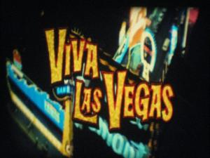
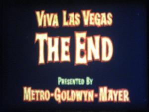
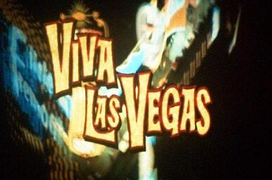
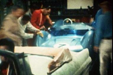
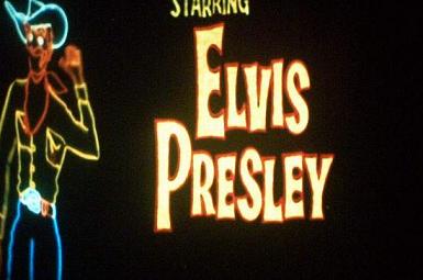
Tonight i cleaned up and viewed my latest purchase from Ian, the 3 x 400ft Viacom print of Viva Las Vegas. This one came to me on a decent plastic 1200ft spool which has a good large core so no side wobble.
As for the print, well, it has to be either LPP or Agfa, the print is stunning with vibrant colours, & absolutely no fade what so ever, (my images do not show how vibrant the colours are by a long way), pin sharp focus and 1st class sound. Very pleased with this one, even the joins are un-noticed as they go through the 1200HD.
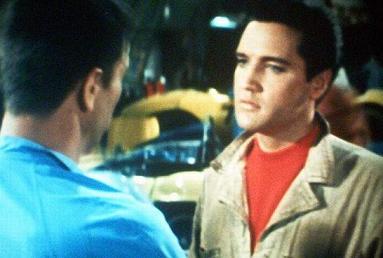
As for the plot, well, did any Elvis film have one, certainly the best of the Elvis films and this edit is very very good with 80% of the edit containing his songs and dance sequences with the very yummy Ann Margret.
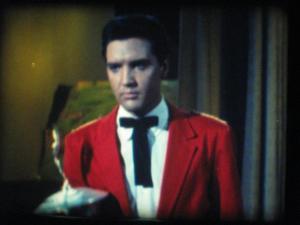
Lucky Jackson (Elvis) goes to Las Vegas, Nevada to participate in the city's first annual Grand Prix Race. However, his race car, an Elva Mk. VI, is in need of a new engine in order to compete in the event.
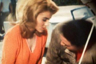
Lucky raises the necessary money in Las Vegas, but he loses it when he is shoved into the pool by the hotel's nubile swimming instructor, Rusty Martin (Ann-Margret). Lucky then has to work as a waiter at the hotel to replace the lost money to pay his hotel bill, as well as enter the hotel's talent contest in hopes of winning a cash prize sizeable enough to pay for his car's engine.
During all this time, Lucky attempts to win the affections of Rusty. His main competition arrives in the form of Count Elmo Mancini (Cesare Danova), who attempts to win both the Grand Prix and the affections of Rusty. Rusty soon falls in love with Lucky, and immediately tries to change him into what she wants.


Posted by Mark Mander (Member # 340) on October 27, 2017, 06:19 PM:
Very nice Tom,I have this from Derann and also a UFA print too,a great cutdown,Mark
Posted by Tom Photiou (Member # 130) on October 28, 2017, 02:01 AM:
Thanks Mark, is the content the same on both versions?
Posted by Mark Mander (Member # 340) on October 28, 2017, 03:21 AM:
Yes it Is,The UFA one was German and now English stereo that was the only difference,Mark
Posted by Osi Osgood (Member # 424) on October 28, 2017, 11:53 AM:
It certainly looks like an L.P.P. print, with the slight bluish caste to the color. Still any super 8 with great color is a cause for celebration! ![[Smile]](smile.gif)
Thanks for the review.
Posted by Tom Photiou (Member # 130) on October 28, 2017, 12:54 PM:
Cheers Osi, i am pretty sure its LPP. The only reason i singled out this title was purly the relorts kn the forums about this particular title. It ertainly lives up to all the reports ive read.
Posted by Winbert Hutahaean (Member # 58) on October 28, 2017, 08:14 PM:
Hi Tom,
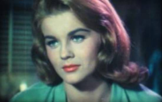
I believe yours is on AGFA since the colors tend to be blueish.
I could say this because I compiled a long time ago of this very title and found the LPP will look like this below screen shots:

The post can be found here:
http://8mmforum.film-tech.com/cgi-bin/ubb/ultimatebb.cgi?ubb=get_topic;f=1;t=005440
Posted by Kevin Clark (Member # 211) on October 29, 2017, 12:03 AM:
Tom & Winbert - both your prints look great whether on LPP or Agfa and so much better than the horrible mess so many of the now faded Eastman & SP prints of these titles have turned into.
I personally can't see the blue caste Osi is describing at all on these - does your eyesight perhaps naturally have a blue bias to it Osi as some of your optical prints would therefore look better to you than they actually are?
Kevin.
Posted by Winbert Hutahaean (Member # 58) on October 29, 2017, 03:42 AM:
Kevin,
Indeed, human eyes (actually the brain) have different perception to a particular color. Most of them because of the culture influence. That is why we recognoize a color called "tosca" which is for somebody else is seen as "blue" or "green". Not to mention "turqoise" for some other culture.
French people will say "maroon" color as "brown", but English culture will see it as "dark red".
But for film prints we can distinguish the color tone by comparing the skin color to say it blueish or purplish.
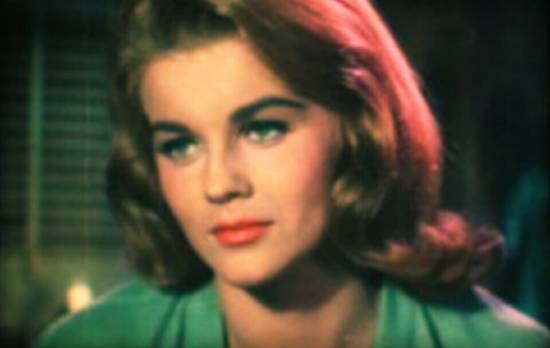
I recreate Tom's screen shots above with color correction software to see how it is better seen, should it not be blueish as I told earlier.
This is Tom's original screen shot:
...compared with below picture, how does this look like it to you?
Cheers,
Posted by Tom Photiou (Member # 130) on October 29, 2017, 04:00 AM:
My screenshogts are not particuly accurate as i on ly use an old 4mp digi camera. The titles,especially the end title are really vibrant yellows while the image ,especially the end almost look white on here. But as you say kevin,im happy whatever the stock as the main thing is its not that awful eastman trash that fades so quickly. By the way, the actual songs in this are a hell of lot better than the majority of elvis films ![[Wink]](wink.gif)
Posted by Kevin Clark (Member # 211) on October 29, 2017, 04:45 AM:
Hello Tom - I agree Viva Las Vegas is definitely one of his better movies song wise - sadly Loving You & Jailhouse Rock never made it to 8mm as far as I'm aware other than as trailers - my musical taste from my teens (until my quiff fell out) were always Rock n Roll, Rockabilly & 50's RnB so it was good to see Elvis releases like King Creole make it to Super 8 too. It's a shame there was no 'Songs from The Girl Can't Help It' digest as that would have made a great 'scope release.
Hello Winbert - I agree colour is very subjective both from cultural description and personal perception. I worked in the copier and printer industry for many years, about 20 years 'on the tools' then into service management - when we started to sell the first colour copiers I was chosen from the tech team following a near perfect enhanced colour vision test - this included the usual colour blindness tests plus enhanced colour perception to ensure you could spot all the positive and subtractive primaries as they were called and also fully understand how they react when combined together and the differences between reflective and refracted light combinations - sounds a bit OTT I know but with those early machines the technology was not supposed to be plug and play like the colour printers we have today, those old beasties were huge the size of two washing machines, and needed regular tweaking to get them right.
I would say Tom's print is just printed colder in the first place - nothing to do with the stock just the printing process, and certainly not a blue caste as all the colours can easily be seen and not tainted blue. The worst 'modern' release I can recall with an obvious blue caste was Derann's Fantasia 2000 - I tried three different prints over the years and all were too far off the correct colour balance for me to keep - all on Agfa but cold as ice colour wise.
The other thing to consider of course is the projector used - halogen, xenon, LED or HID lamp? Elmo or Schneider or other lens used? All these factors affect the screen shots even before the camera is taken into consideration.
Just in case anyone reading this wants to check their own basic colour perception a good starting point is this site:
http://www.color-blindness.com/color-blindness-tests/
Hopefully your monitors / screens are calibrated correctly too!
Kevin
Posted by Tom Photiou (Member # 130) on October 29, 2017, 06:50 AM:
Great stuff there kevin. Have to say i am red and green colour blind. Really gutted as i wanted to become a train driver but that colour test was a no for me.
Posted by Brian Fretwell (Member # 4302) on October 29, 2017, 07:00 AM:
On some DVD & Blu Ray forums there are complaints about re-grading of colour restorations as being "Tealed", moving to a colder balance. So it doesn't only apply to film prints, it seems to be a grading trend that has been around for some time.
Posted by Mark Mander (Member # 340) on October 29, 2017, 07:26 AM:
At the end of the day it's not pink,Mark
Posted by Tom Photiou (Member # 130) on October 29, 2017, 12:32 PM:
Exactly Mark, its a great print
Posted by Osi Osgood (Member # 424) on October 31, 2017, 11:52 AM:
I agree as well.
Visit www.film-tech.com for free equipment manual downloads. Copyright 2003-2019 Film-Tech Cinema Systems LLC

UBB.classicTM
6.3.1.2