This is topic Same Print, Different Cover in forum 8mm Forum at 8mm Forum.
To visit this topic, use this URL:
https://8mmforum.film-tech.com/cgi-bin/ubb/ultimatebb.cgi?ubb=get_topic;f=1;t=008509
Posted by Douglas Meltzer (Member # 28) on August 27, 2013, 08:24 PM:
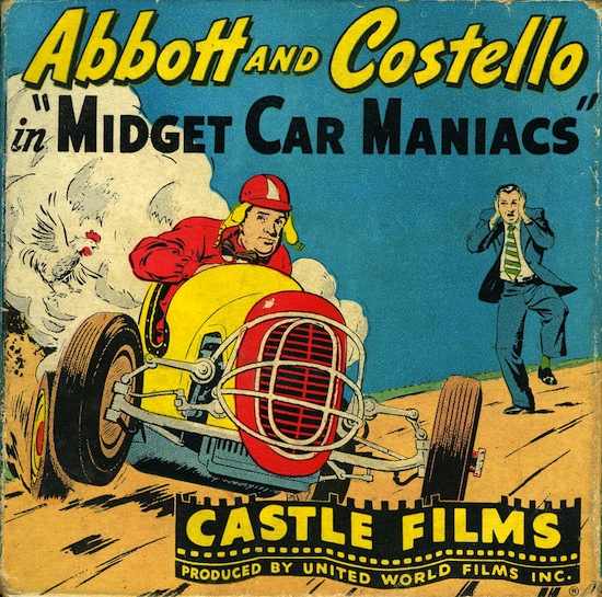
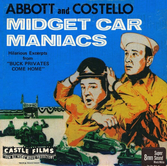
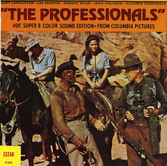
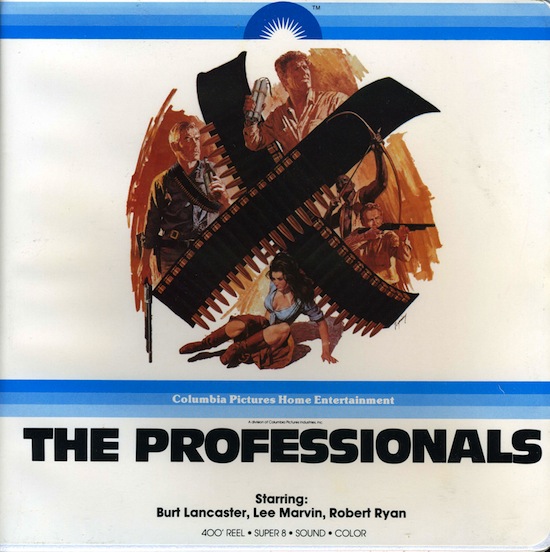
Every so often a distributor felt the need to "freshen up" the artwork for their releases. Here are a few examples:
___
___
Doug
Posted by Hugh Thompson Scott (Member # 2922) on August 28, 2013, 12:23 AM:
I didn't realise, until Doug pointed it out, that there were TWO
different covers to the Professionals, I assumed one was for the foreign market.
Posted by David Ollerearnshaw (Member # 3296) on August 28, 2013, 01:33 AM:
I wonder if the first scan of "The Professionals" is the original card box? The second is the same as mine in the plastic library case.
Posted by Robert Crewdson (Member # 3790) on August 28, 2013, 02:35 AM:
I wish they wouldn't do that, it's the same with record covers and books.
Posted by Douglas Meltzer (Member # 28) on August 28, 2013, 08:54 AM:
David,
Yes, that first Professionals scan is the cardboard box. Columbia changed their artwork for a number of their titles.
Doug
Posted by Chris Fries (Member # 2719) on August 28, 2013, 10:53 AM:
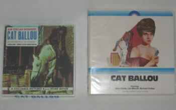
Here's another Columbia title.
CAT BALLOU
Not only was the box changed but they are actually different films because of the way they were edited.
Posted by Hugh Thompson Scott (Member # 2922) on August 29, 2013, 02:09 PM:
I didn't know that either Chris, although Mountain Films in the
UK also did a different edit of "Cat Ballou" & "The Professionals".
Theirs had a running time of 12 - 13 mins.
Posted by Michael O'Regan (Member # 938) on August 29, 2013, 02:16 PM:
Maybe I'm wrong, but didn't Castle occasionally release two different versions of their cutdowns - I'm thinking, in particular, of Son of Frankenstein.
Posted by David Ollerearnshaw (Member # 3296) on August 29, 2013, 03:11 PM:
I think Mountain Films when they originally did the Columbia digests they were shorter than the US versions. The same with Ken Films, Fox films. I remember one ad for "The Sound Of Music" boasting about the longer running time. Not sure if it was an ad by Mountain or Portland Films (same company though).
I have a Columbia 400ft of "The Guns Of Navarone" in just a yellow box with Columbia Pictures logos on it. I wonder did this get a makeover.
Posted by Hugh Thompson Scott (Member # 2922) on August 29, 2013, 03:13 PM:
Well Michael, in a way you're right, Castle released a 200', while
Universal 8 released a 400' , both titles can be combined, as their
is a chunk from the 200' that splices onto the 400', if I remember.
Lovely films.We're talking Universal here, the Castle/Universal
releases.
Posted by Graham Sinden (Member # 431) on August 29, 2013, 04:26 PM:
One title that comes to mind is Mickey Mouse - The first fifty years. Ive seen at least 3 different boxes for it. A red box, a silver box and one with a large '50' on the front.
Graham S
Posted by Bill Phelps (Member # 1431) on August 29, 2013, 04:40 PM:
Michael...yes Castle's 200' Son Of Frankenstein was re-edited in the early 1970's so that film had the same box art but two different prints.
Bill ![[Smile]](smile.gif)
Posted by Hugh Thompson Scott (Member # 2922) on August 29, 2013, 04:49 PM:
What were the differing scenes Bill?
Posted by Bill Phelps (Member # 1431) on August 29, 2013, 04:56 PM:
Well I only have the first issue that came out in 1965 that had long lab scenes with the monster laying on the table. The second one came out in the early 1970's and featured more footage of Boris and Bela but I have not seen this one. I am only repeating info from this forum in fact! Maybe someone who knows the scenes exactly could reply.
Bill
Posted by Michael O'Regan (Member # 938) on August 29, 2013, 05:07 PM:
Are you certain that they had the same box art, Bill?
Posted by Bill Phelps (Member # 1431) on August 29, 2013, 05:10 PM:
The Castle 200's did. The U8 box had the Warhol style graphics.
Bill
Posted by Michael O'Regan (Member # 938) on August 29, 2013, 05:23 PM:
Thanks.
I had the feeling that as well as the more recognisable cover, there was also a box with art similar to this one
http://www.ebay.com/itm/Vintage-8mm-home-movie-Abbot-and-Costello-meet-FRANKENSTEIN-RARE-/390651150005?pt=LH_DefaultDomain_0&hash=item5af49f7eb5
Posted by Bill Phelps (Member # 1431) on August 29, 2013, 05:35 PM:
That would be Bride Of Frankenstein...with the bride in the place of A&C....the Castle's Son Of Frankenstein had Basil looking in the magnifying glass.
Actually there are many of the Castle A&C's with different covers and being a completest collector that's bad news because I like having all the covers!
Bill
Posted by Michael O'Regan (Member # 938) on August 29, 2013, 05:37 PM:
Thanks. You're right. It was Bride.
Posted by Douglas Meltzer (Member # 28) on August 29, 2013, 08:02 PM:
Chris,
Thanks for showing the two Cat Ballou covers. Columbia released their second edit before the clamshell cover....just a year or two after the original edit. They decided to feature more of Lee Marvin's character(s) in the re-edit.
Michael, Bill & Hugh,
The differences in the two Castle Son of Frankenstein versions can be found in this thread and yes, they both used the same artwork.
David,
The UK release of Guns of Navarone had a b&w still of Niven, Peck and Quinn on the cover.
Doug
[ August 29, 2013, 09:24 PM: Message edited by: Douglas Meltzer ]
Posted by Hugh Thompson Scott (Member # 2922) on August 29, 2013, 10:29 PM:
As I mentioned in an earlier post, I had difficulties trying to get
the Mountain version in colour from them, I already had it in B/W
but you would have thought it was a pirate version by the
obstacles I had to overcome, they even seemed to comfuse themselves with " Jumbo" & " Jumbo Giant" description of films.
Eventually, I won, but it took weeks, I don't know if the Mountain
version ever got State side, but thanks to our Doug for illuminating
this part of film collecting,especially the box collecting fraternity, which must be annoying.
What with differing versions from the same stable, plus foreign
versions as well, it's a bloody nightmare!
Posted by Douglas Meltzer (Member # 28) on August 31, 2013, 11:43 PM:
Here's a case of the same print having three different covers!
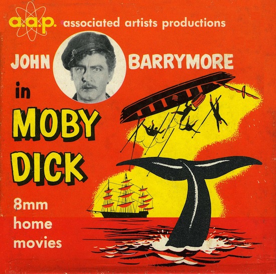
Standard 8mm silent release from a.a.p., who later became....
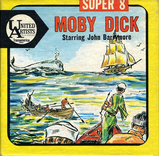
....UA-8. I believe this next cover was put into service when Ken Films took over.
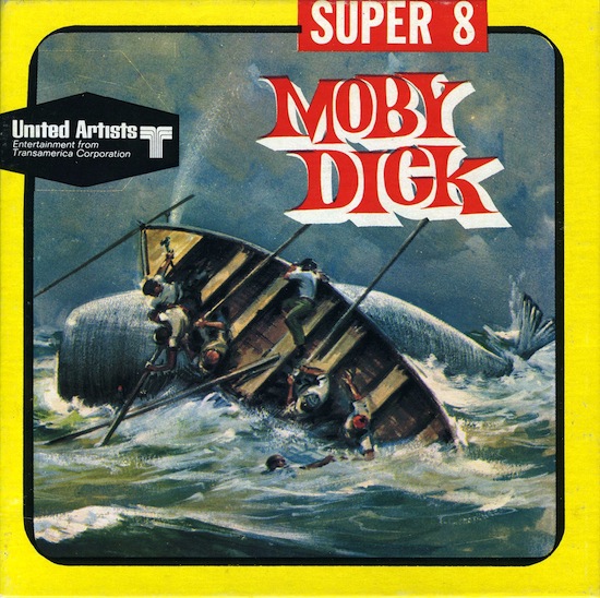
Nice artwork on this one.
Side note: This 1930 feature takes many liberties with Melville's story. Ahab starts out with both legs and a love interest. He loses a leg chasing after the great white whale and believes he has lost his love because he has lost his limb. He heads out again for revenge, kills the whale, returns home and finds true love!
Doug
[ September 01, 2013, 12:01 AM: Message edited by: Douglas Meltzer ]
Posted by Maurice Leakey (Member # 916) on September 01, 2013, 02:27 AM:
The red box issue of "Mickey Mouse-The First Fifty Years" was a special collector's edition with a slide-on clear plastic lining. The box had a hinged cover, and a special illustrated booklet came with it.
Posted by Mark L Barton (Member # 1512) on September 01, 2013, 03:56 AM:
I find the early Ken cover art work is awful, as if the 'artist' has traced over the original poster art at some point, ie The Poseidon Adventure. The original Poseidon poster is a work of artistic genius by Mort Kunstler, by the time Ken's art department had finished with it we have a scribbled and bastardised cover. Shame. The Columbia vacuum covers and universal 8 hard case slip covers were always excellent.
Posted by Robert Crewdson (Member # 3790) on September 01, 2013, 06:46 AM:
You must have a great collection Douglas. I never knew there was an earlier version of Moby Dick; as the last cover doesn't mention John Barrymore, anyone seeing this in a catalogue would assume it was the Gregory Peck version.
Posted by Jean-Marc Toussaint (Member # 270) on September 01, 2013, 06:53 AM:
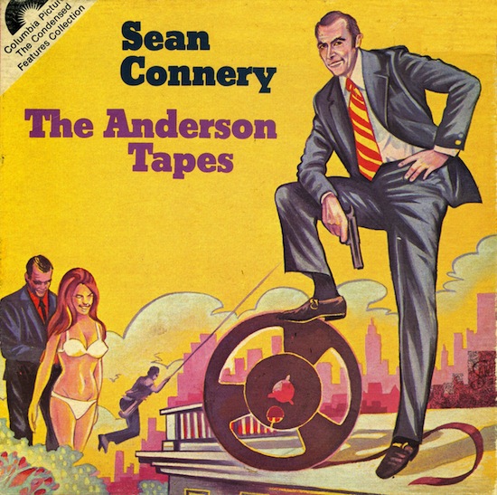
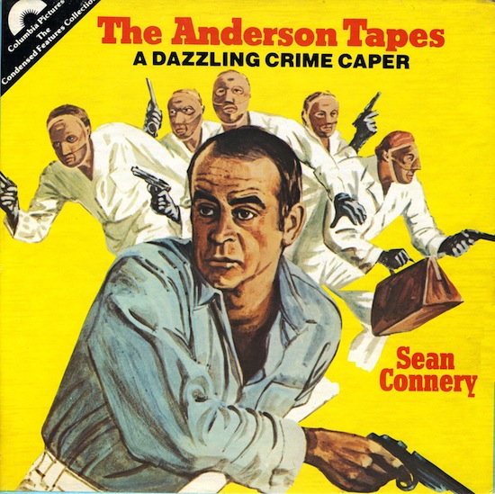
The tape reel on the first cover of The Anderson Tapes looks like a super 8 spool... ![[Wink]](wink.gif)
Posted by Douglas Meltzer (Member # 28) on September 01, 2013, 09:45 AM:
Mark,
Some of the early silent Ken releases have terrific covers. Many of them are in this Great Box Art thread. To me, the Ken cover for Sound of Music is their laughable low point. We should start a "Worst Box Art" thread.
Jean-Marc,
I should have held onto that one for a new cover art quiz!
Robert,
True, however the side flap makes that distinction and to their credit, the catalog lists the title as "Moby Dick with JOHN BARRYMORE".

Doug
Posted by Robert Crewdson (Member # 3790) on September 01, 2013, 10:08 AM:
Interestingly, this was a remake of a silent film he made 4 years earlier, titled The Sea Beast. Would love to see the complete feature.
Douglas 'The Worst Box Art' thread sounds a good idea.
Posted by Douglas Meltzer (Member # 28) on April 09, 2016, 01:26 PM:
I thought I'd revive this topic with another cutdown that made an appearance in three different boxes.
UA-8 version 1
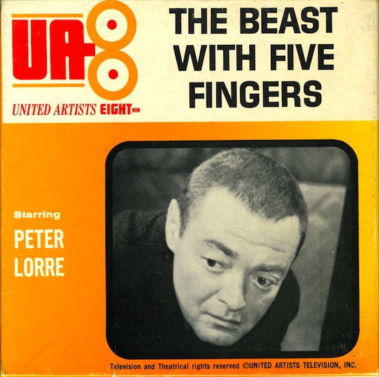
The only one where they spell the star's name correctly!
UA version 2

UA/Ken Films version 3
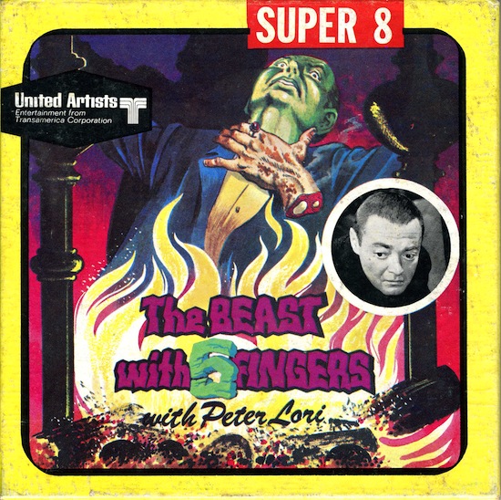
Poor Mr. Lorre!
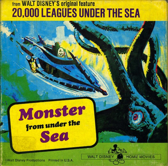
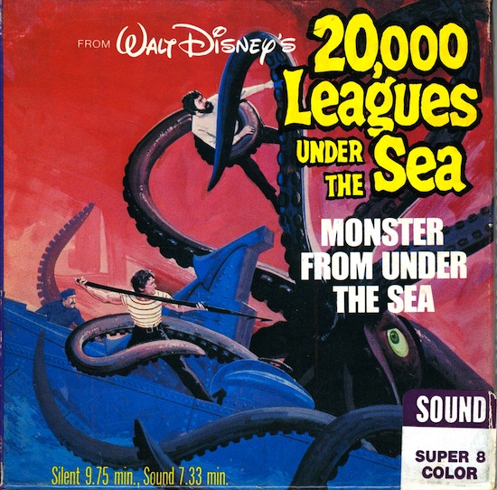
Disney changed the artwork on a number of their titles:
Doug
Posted by David Ollerearnshaw (Member # 3296) on April 09, 2016, 02:26 PM:
I noticed that The Professionals mentions ester on the front.
The Columbia titles were not originally distributed by Mountain Films in the UK Capital Films used to do them.
Posted by Joseph Randall (Member # 4906) on April 09, 2016, 06:54 PM:
My MIDGET CAR MANIACS is in a generic Abbott & Costello box.
Blackhawk changed the Laurel and Hardy boxes a few times -- early ones for the silents had a still on the cover from the movie contained within.
Visit www.film-tech.com for free equipment manual downloads. Copyright 2003-2019 Film-Tech Cinema Systems LLC

UBB.classicTM
6.3.1.2